Monday, October 25, 2010
Thursday, October 21, 2010
Katie's invite design


Really like the front/back connection. Nice work...
Wednesday, October 20, 2010
Sunday, October 17, 2010
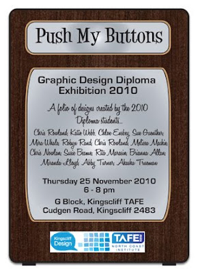
PMB invitation

 The old typewriter keys was the inspiration for the invitation design. The overlapping black
 slats being the type bars and the type keys for my buttons. I've used 2 variation of type font
to add a bit of interest.
Thursday, October 14, 2010
Wednesday, October 13, 2010
Robyn Rand's Invitation


The ideas I had for the exhibition invitation are above, the robot is something we can identify with, being personalised by having a face and a personality, a little like us. Being graphic design diploma students there are occasions that we work a little like robots and certainly feel that way when we leave class. The colour pallet chosen is a sort-of retro pallet, in the 40's apparently there was a lot of tin toys which were coloured in the orange and green - they are also fresh and inspirational colours. The blue type on the back of the postcard is to represent pen or biro. The wording on the back of the postcard is in a casual fashion to make the reader feel like they are receiving a letter from a friend.
On a website the robot will be flexible enough to be able to do many things as well as be animated or have it's own noises and sounds. Each persons button on the robot can be active and lead to that persons work samples and links. Below is a rough idea for a possible poster - if it were to be in landscape the work samples could be rearranged slightly and the robot stood to the side.

I'm not sure what happened to the logos on the first poster, they seem to of disappeared when I flattened it, but it was the wrong format anyway, so I redid it, with the robots mouth a bit wider, I put a stroke around the words to make them look a bit more neon/electric but I think I might get rid of it.

Tagline suggestion
1..Push my buttons to be inspired
2..Push my buttons to explore design
3..Push my buttons for visual innovation
4..Be stimulated....visually
Tuesday, October 12, 2010
MIRANDA: Tagline Ideas...
"A glimpse into the creative minds of 14 up and coming graphic designers."
Subscribe to:
Comments (Atom)


